With a network exceeding 400 million users, LinkedIn holds a rich data resource when it comes to jobs, qualifications and industries across the world.
But with any data, the question is how that can be used effectively to find patterns, trends and stories from which you can inform and improve.
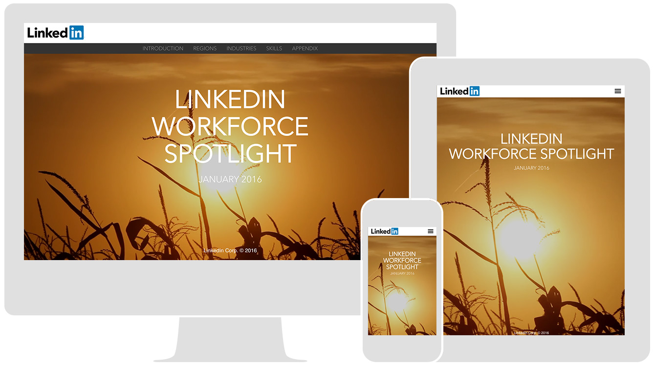
To do just that, LinkedIn recently launched a new series called LinkedIn Workforce Spotlight.
The monthly reports each focus on a different region of the US. The first report in January looked at Iowa, the second, in February, at New Hampshire and the third put the spotlight on Texas.
Created in Shorthand, the reports combine rich, full-screen media setting the scene or representing the relevant industries.
Simple, clean text offers easy-to-follow analysis of the numbers, with graphics and charts offering visual representations of data comparison – this includes figures from other organisations like the Bureau of Labor Statistics and the US Census Bureau and Department of Education.
The clean style, combining white space and full-screen graphics for visual richness between analysis, offers a succinct but engaging format for statistical analysis with a focused narrative.